




Boreas 1903 By John William Waterhouse



Is This the Right Painting for Your Wall?
Not sure whether this painting is the right size, style, or color for your space? Read our guide to Choosing the Right Oil Painting for Your Wall.
What Is Boreas (1903) by John William Waterhouse?
Boreas (1903) is an oil painting by John William Waterhouse depicting a lone female figure caught in a sudden gust of wind. Inspired by the north wind of Greek mythology, the painting is celebrated for its animated drapery, controlled palette, and striking sense of motion, and is widely regarded as a masterpiece of Waterhouse’s late Pre-Raphaelite art movement.
Rather than illustrating a narrative scene, the composition focuses on physical sensation—wind, resistance, and movement, using gesture and fabric as its primary visual language.
Long regarded by scholars as one of Waterhouse’s late masterpieces, his painting later confirmed its status when it set a record auction price for the artist in the 1990s.
Why Boreas Matters
Boreas (1903) represents the culmination of Waterhouse’s late style. Art historians widely regard Boreas (1903) as one of the most psychologically refined works of John William Waterhouse’s late career, marking a shift away from narrative myth toward emotional and atmospheric symbolism.
Instead of portraying a literal god, the painting uses myth as a psychological metaphor, exploring vulnerability, disruption, and emotional instability through nature. This synthesis of mythology, mood, and introspection makes Boreas one of the most intellectually sophisticated mythological paintings of the late Victorian period.
When was Boreas painted?
Boreas was painted in 1903, during the mature phase of Waterhouse’s career. By this point, his work had shifted toward simplified compositions, restrained color harmonies, and an increased focus on mood conveyed through pose and setting rather than explicit storytelling.
How Did the Royal Academy Describe Boreas?
At the 1904 Exhibition of the Royal Academy of Arts, the painting was praised for its expressive movement. Contemporary descriptions focused on the woman’s “wind-blown draperies” in slate-gray and blue tones, set within a spring landscape dotted with daffodils and soft pink blossoms.
A single yellow daffodil behind the woman’s ear provides a sharp chromatic contrast, heightening the painting’s themes of fragility, transition, and tension between renewal and disturbance.
What Defines the Composition of Boreas?
- A compressed sky band that heightens pressure within the frame
- Trees bent sharply by the wind, echoing the direction of the drapery
- A figure bracing instinctively, hands raised in response rather than control
- Layers of fabric revealing and concealing the blue dress beneath
- An averted gaze that denies viewer engagement
The composition prioritizes directional force and resistance, guiding the viewer’s eye through movement rather than narrative detail.
Who Is Boreas in Greek Mythology?
In Greek mythology, Boreas is the god of the cold north wind, associated with winter storms, sudden tempests, and emotional volatility. Traditionally depicted as a winged, bearded male figure wrapped in flowing garments, Boreas symbolized invisible force and unpredictable power.
How Does Waterhouse Reinterpret Boreas?
Waterhouse departs from traditional depictions of Boreas as a winged male god by presenting the wind as an embodied human presence.
Classical attributes such as flowing garments and obscured hair remain, but dominance is replaced with hesitation and restraint.
The result is not a personified deity, but a visual embodiment of force acting upon the human figure.
Why Is Boreas Set in a Spring Landscape?
The spring setting introduces deliberate tension:
- Literal reading: early spring winds in England, when winter lingers despite renewal
- Symbolic reading: emotional cold interrupting warmth, restraint disrupting growth
In both interpretations, the landscape reinforces the painting’s central theme of unsettled beauty.
What Is the Myth of Boreas and Orithyia?
A deeper mythological layer draws on the story of Orithyia, whom Boreas abducted after she rejected him. According to legend, Boreas enveloped her in a cloud before carrying her away.
The woman’s cloud-like gray drapery may allude to this myth, introducing unsettling undertones of loss of control, captivity, and psychological vulnerability beneath the painting’s serene surface.
What Art Style Is Boreas?
Boreas is a defining example of late Pre-Raphaelite painting.
Although Waterhouse began in a Neo-Classical mode aligned with Royal Academy traditions, he later embraced Pre-Raphaelite ideals—emotional sincerity, mythological symbolism, and nature as a psychological mirror, while developing a more restrained, atmospheric tone.
How Does Waterhouse Relate to the Pre-Raphaelite Brotherhood?
Although not a founding member of the Pre-Raphaelite Brotherhood, whose core figures included William Holman Hunt, Dante Gabriel Rossetti, and John Everett Millais, Waterhouse became one of the movement’s most accomplished later interpreters.
He fused their symbolic storytelling with greater psychological subtlety and emotional restraint.
Why Is Boreas Historically Important?
After disappearing from public view for decades, Boreas resurfaced in the mid-1990s, attracting major scholarly and collector attention. When auctioned, it sold for over $1.2 million, setting a record price for a Waterhouse painting at the time and reaffirming his importance within late Victorian art.
Where Can You Buy Pre-Raphaelite Paintings?
Because of its lasting artistic importance, Boreas (1903) by John William Waterhouse is one of the most frequently reproduced works from his late career. High-quality, hand-painted reproductions allow collectors to experience the painting’s movement, color harmony, and emotional intensity at scale.
Presented separately from the historical analysis above, reproductions offer a way to appreciate this celebrated work without replacing its original context or scholarly significance.
Our catalog offers museum-quality reproductions that capture the color, detail, and emotional depth of these iconic mythological and romantic masterpieces.
All our hand-painted oil painting reproductions are backed by a 45-day, 100% refund or replacement guarantee, so you can order with complete confidence.
We ship free to anywhere in the world via FedEx or DHL expedited service with online tracking.
Your painting will be shipped rolled in strong plastic tubing, ready for stretching and/or framing locally. This is the conventional method of transporting hand-painted oil on canvas. Learn more about how your painting is shipped.
We are able to offer a framing service intercontinental U.S. Please contact us if you would like a quotation. Alternatively, should you prefer, we can recommend a framer in your area.
Your painting will be shipped directly from our Studio in Thailand.
After helping customers choose hand-painted oil paintings for many years, one pattern appears repeatedly. Most people have little difficulty identifying the paintings they are drawn to. The greater challenge is deciding which size will work best, how the artwork will relate to the room, and whether it will remain enjoyable to live with over time.
A painting can completely alter the atmosphere of a room. Sometimes a space that feels unfinished suddenly becomes balanced once the right artwork is installed. Other times, beautifully furnished interiors never feel entirely comfortable because the painting is too small, too visually demanding, or disconnected from the surrounding architecture.
Over the years, we have found that the paintings people continue to enjoy are rarely chosen solely because they match the furniture. Scale, wall proportions, natural light, ceiling height, viewing distance, and personal connection all influence whether artwork feels naturally integrated into a home.
The most successful interiors usually feel personal rather than overly planned. Paintings often work best when they are chosen because they suit the room, reflect the owner's taste, and remain enjoyable to live with over time.
Most Rooms Need Larger Paintings Than People Expect
One of the most common mistakes people make when choosing artwork is being too cautious with scale.
A painting can look surprisingly substantial on a computer screen or even inside a gallery, then feel much smaller once it is placed above a large sofa or on a wide, uninterrupted wall.
Many homeowners are surprised by how much visual space a room absorbs once furniture, lighting, and viewing distance are taken into account.
Rooms with higher ceilings often require larger paintings than people initially expect. A painting that feels substantial in a standard-height room can sometimes appear visually disconnected when placed on a tall wall with significant empty space above and below it. This is one reason artwork selected for apartments, lofts, and contemporary homes with higher ceilings is often larger than customers originally planned.
Open-plan interiors are particularly challenging because paintings are often viewed from several feet away rather than up close. A size that feels generous when viewed online can sometimes feel lost once installed within a larger living space.
Paintings in open-plan interiors are frequently viewed from much greater distances than people realize. A painting above a sofa may also be visible from the dining area, kitchen, hallway, or staircase. For this reason, artwork that appears generously sized when viewed up close can sometimes feel surprisingly small in the finished room.
For this reason, many people find that they would have been happier choosing a larger size. That does not mean every room requires oversized artwork, nor does it mean a collection of smaller paintings cannot work beautifully. However, when a painting is intended to act as a focal point, slightly larger dimensions are often more successful than most people initially expect.
Most Paintings Are Hung Too High
This is something people often do without realizing it, particularly in homes with higher ceilings.
A useful way to assess placement is to spend time in the room and view the painting from the positions where it will most often be seen. In living rooms, this may be from a sofa, while in hallways, dining rooms, and entrance halls, it is more likely to be from a standing position.
Rather than focusing on a specific measurement, consider whether the painting feels naturally connected to the surrounding furniture and architecture. If viewers find themselves looking noticeably upward to appreciate the artwork, the painting may be hanging higher than necessary. In most interiors, artwork feels most comfortable when it can be viewed easily and naturally without drawing attention to its placement on the wall.
Why Light Matters More Than People Realize
Natural light changes paintings throughout the day. This is something many people only notice after the artwork arrives and is hanging on the wall.
A painting that looks bright and vibrant in a sunlit room during the morning can feel quite different in the evening under artificial lighting. Wall colors, flooring, ceiling height, window placement, and even the direction a room faces all influence how colors and details are perceived.
Oil paintings are particularly sensitive to changing light because textured brushwork and layered paint surfaces reflect light unevenly across the canvas. This gives oil paintings much of their character, but it also means they rarely look the same from one time of day to another.
Paintings with softer palettes and atmospheric brushwork often adapt naturally to these changing conditions. This is one reason Impressionist paintings remain consistently popular in residential interiors. By contrast, paintings with very dark backgrounds or dramatic shadows can sometimes feel considerably heavier in person than they appear in a photograph, particularly in rooms that receive limited natural light.
For this reason, it is often helpful to think about when a room is used most frequently. A painting viewed primarily during daylight hours may create a very different impression from the same painting viewed mainly in the evening.
Some Paintings Reveal More Over Time
Not every painting makes its strongest impression immediately.
Some artworks attract attention within seconds because of a dramatic subject, bold color, or familiar image. Others are quieter. Their appeal often develops gradually as the viewer begins to notice smaller details, relationships within the composition, or aspects of the painting that were not obvious at first glance.
This is something many people discover only after a painting has been hanging in their home for some time. An artwork that initially seemed straightforward may continue to reveal interesting details, while a painting chosen purely for its immediate impact can sometimes become less interesting once the novelty has worn off.
When viewing paintings online, there is a natural tendency to make decisions quickly. However, it is often worth spending a little longer with the artworks that repeatedly draw your attention. The paintings that reward a second or third look frequently possess a depth that is difficult to appreciate from a brief first impression alone.
This does not necessarily depend on the age, style, or monetary value of a painting. What matters is whether the artwork continues to hold interest over time. In our experience, paintings that invite repeated viewing often become some of the most satisfying works to own because they remain engaging long after the initial purchase decision has been forgotten.
The Room Often Matters More Than the Furniture
When choosing artwork, many people focus primarily on furniture, wall colors, and decorative accessories. Yet the architecture of a room often has an equally important influence on how a painting is perceived.
For example, a large contemporary room with clean lines and open walls can comfortably support paintings that might feel overwhelming in a smaller, more traditional setting. Equally, a classical interior with decorative moldings, timber furnishings, and period features can often accommodate paintings with greater visual complexity than a minimalist space.
When choosing artwork, it is often helpful to think about the room as a whole rather than focusing on individual furnishings. Paintings tend to feel most successful when they relate naturally to the scale and character of the space in which they will be displayed.
Successful interiors do not necessarily depend on exact color matching. Artwork often works best when it complements a room without feeling obliged to repeat every color already present within the furnishings.
Visualizing a Painting in Your Home
One of the biggest challenges when choosing artwork online is imagining how the painting will actually look once it is installed. A painting that appears substantial on a computer screen can feel surprisingly small on a large wall, while an oversized painting can sometimes look far more balanced in a room than expected.
For this reason, many customers find it helpful to look beyond the product image and consider how the artwork will relate to the space in which it will be displayed. Ceiling height, furniture placement, wall proportions, natural light, and viewing distance all influence how a painting feels within a room.
A simple technique used by many interior designers is to cut a piece of craft paper, newspaper, or cardboard to the exact size of the painting being considered and temporarily attach it to the wall using removable adhesive such as Blu Tack. This provides an immediate sense of scale and often helps people decide whether they would be happier with a larger or smaller size before placing an order.
Customer installation photographs can also be helpful because they show paintings displayed in real homes rather than in isolation. Seeing completed paintings within finished interiors often provides a clearer understanding of proportion, placement, and how different styles of artwork interact with a living space.
After viewing customer installation photographs, many people discover that paintings they initially considered oversized often look remarkably balanced once installed. Seeing artwork displayed in real homes frequently provides a clearer understanding of scale, wall proportions, and visual impact than dimensions alone can.
For customers who would like additional assistance, our team is also happy to review photographs of a room and discuss possible painting sizes, subjects, or placement options. In many cases, a second opinion can help narrow the choice between several paintings or confirm whether a particular size is likely to work well within the space.
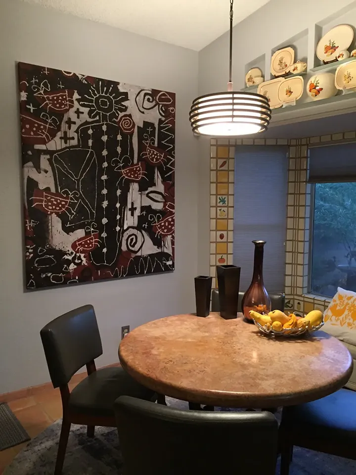
Customer Installation: Large Painting in Small Dining Room
One of the most common surprises when viewing customer installations is how comfortably larger paintings can sit within relatively small rooms. This dining area demonstrates how a well-proportioned painting can create a strong focal point without overwhelming the surrounding space.
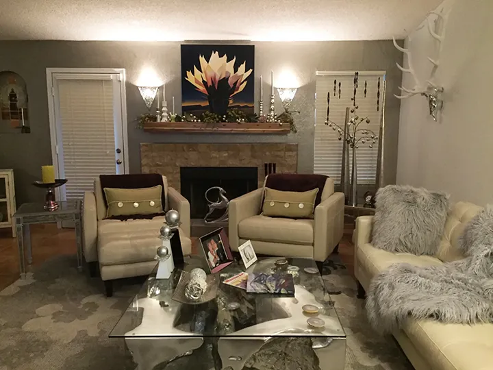
Customer Installation: Proportions Over a Fireplace
This customer photograph illustrates how the right proportions are sometimes more important than size alone when selecting paintings for a room.
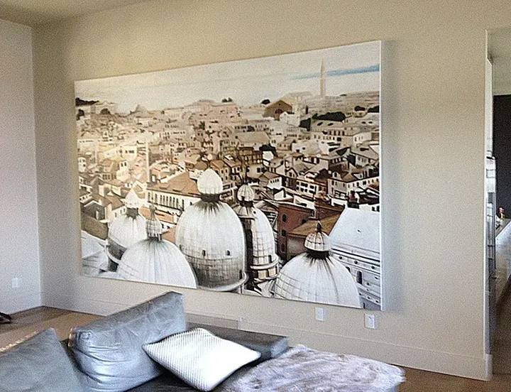
Customer Installation: Oversized Horizontal Painting Above Sofa
Customer installation photograph showing the relationship between artwork, wall space, furniture, and room proportions within a finished interior.
Trust Your Instincts
Ultimately, there is no formula that guarantees the perfect painting. Size, placement, lighting, and room proportions all matter, but they are only part of the decision. The paintings that people treasure most are often the ones that immediately capture their attention, spark their imagination, or feel right from the beginning. If a painting speaks to you, continue returning to it, and if you can genuinely imagine living with it for many years, it is often worth trusting that instinct. A well-chosen painting is more than decoration; it becomes part of the home and can provide enjoyment, interest, and inspiration for years to come.
Notes About Your Painting
All of our paintings come with a 7.5cm (just under 3") clean surplus canvas so the framer can achieve good leverage and easy stretching.
Recently Viewed: